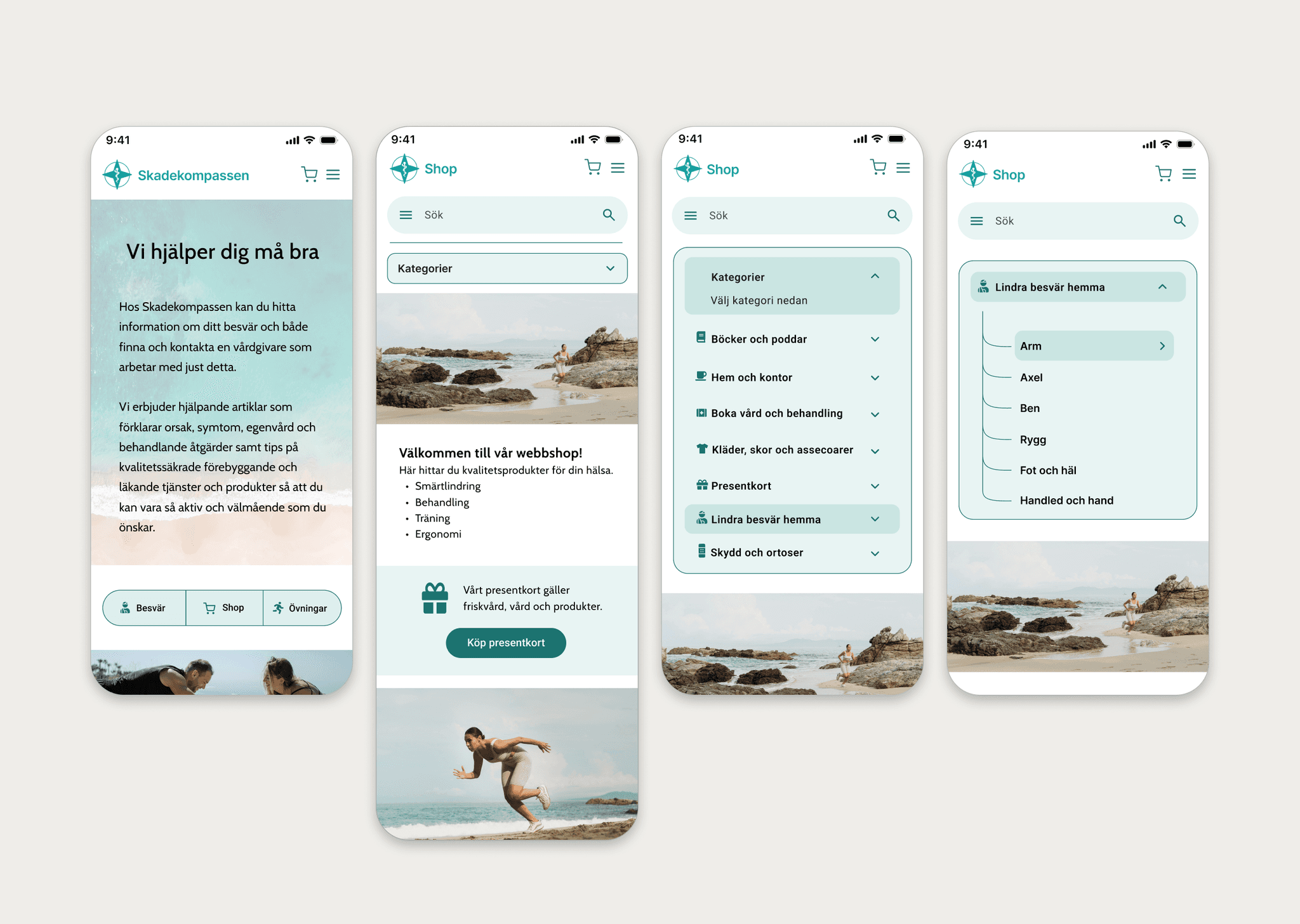
Overview
This project focused on improving the usability and accessibility of a healthcare e-commerce website.
The original website had poor navigation, low color contrast, and a confusing user flow. Users struggled to find relevant treatments and complete actions efficiently.
Through accessibility analysis, user interviews, and usability testing, we identified key pain points and opportunities for improvement.
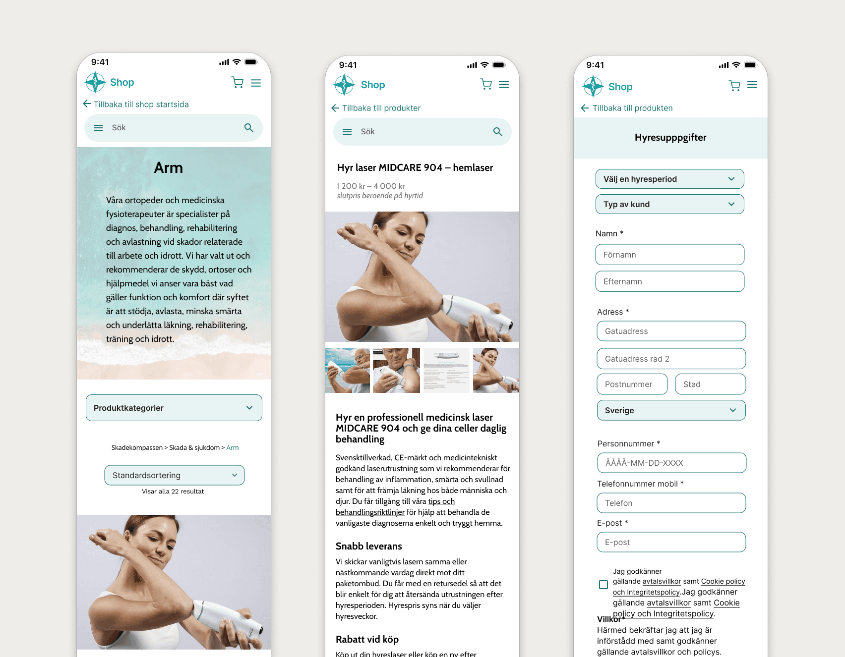
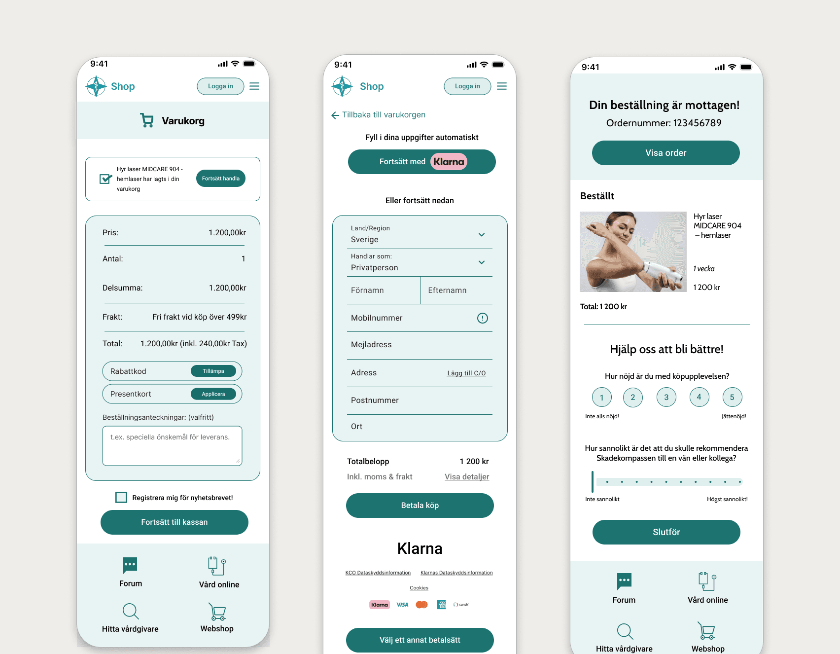
We redesigned the experience with a focus on clarity and simplicity.
Key improvements included:
Improved navigation and category structure
Better color contrast for accessibility
Reduced text and improved content hierarchy
Clear call-to-action buttons
More intuitive user flow
I was responsible for accessibility analysis and led most of the final UI design.